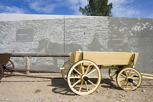
The special prize for the architect for the open space “Teeaeg” of Estonian Road Museum went to Maarja Kask, Karli Luik, Ralf Lõoke and Pelle-Sten Viiburg from Salto architectural office, and the special prize for the architect for the idea of graphic concrete went to Malle Jürgenson, Krista Lepland and Tea Tammelaan from Laika, Belka & Strelka design office.
Client: Road Administration of the Southern Region of Estonia, South-East Road Office.
Constructor: Jaan Port.
Builder: KPK Teedeehitus Ltd.
Concrete works: YIT Ehitus Ltd.
Producer of graphic concrete elements: E-Betoonelement Ltd.
Reasons for nomination: This is a unique exhibition environment in the open air that in addition to introducing the history of traffic and roads, offers possibilities for resting and gaining knowledge of traffic education. The road runs in a so-called trench, the exhibition area has been dug lower from the rest of the landscape and it forms a long 8-shaped row. The winding journey makes it possible to present the road and the surrounding space so that there is only one period and one place in sight at a time. Passing through the exposition, there are concrete elements lining the journey, which have been fixed on the retaining wall and decorated with scenery using the technique of graphic concrete. The accuracy and sharpness of the images can be compared to the old, slightly raddled black and white photos or film frames.
Opinion of the jury: In case of the exhibition area that suits perfectly in the landscape, the concrete is not the main performer but only one part of the ensemble. The work of the architect and the interesting solution of graphic design deserve to be singled out the most.
Without doubt, the whole complex has a better effect in summer than in winter when it is snowbound, but it cannot be desired that structures meant for using in summer would be attractive also in winter in Estonian climate.
Graphic concrete could have been used more, and more boldly, in addition to the exposition area also in the leisure area. Instead of PVC-pictures near the entrance and in the traffic village, graphic concrete would have a far more exciting effect but it is clear that the prices of these solutions are very different.
The graphic concrete “photos” are more attractive when looked at from distance, graphic concrete is not very appealing when looking at it close but it seems somewhat dirty and pale. This was probably the aim of the architects – to emphasize the historical value.
In summary, this is still an original object where graphic concrete has been used ingeniously.

Road museum